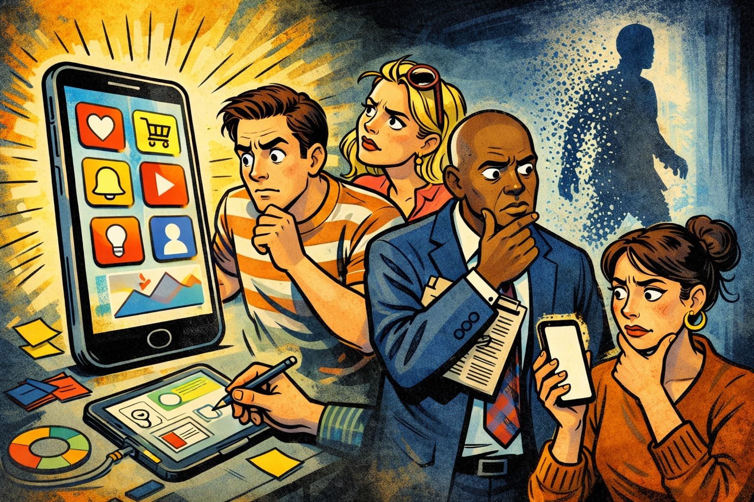
A crowded commuter train lurched around another corner as dozens of strangers lowered their heads toward glowing screens. News, shopping, banking, entertainment, friendships, and careers all competed inside a rectangle that could disappear into a pocket within seconds. Nobody announced a winner. Every swipe quietly crowned one experience while abandoning another. That silent contest explains why mobile design has become far more than aesthetics. Every pixel now negotiates with human attention, and hesitation almost always loses before curiosity has a chance to become commitment.
Many organizations still approach mobile experiences as smaller versions of desktop websites. Human behavior refuses that shortcut. A phone accompanies interruptions, distractions, crowded elevators, impatient queues, and fleeting moments between meetings. Duolingo embraced this reality by designing interactions that reward quick progress instead of demanding uninterrupted concentration. Jewelry entrepreneur Mirela discovered an equally revealing lesson after simplifying her checkout into fewer decisions. Customers completed purchases during coffee breaks because convenience respected the rhythm of everyday life rather than resisting it.
Attention on mobile resembles a hummingbird hovering between flowers. Every unnecessary tap drains energy before satisfaction arrives. Instagram understood this instinct long before competitors, building interfaces where discovery feels almost effortless, encouraging exploration without obvious friction. Independent bookseller Kenji redesigned his online catalog after noticing readers abandoned lengthy menus but eagerly explored curated collections with simple visual cues. Browsing became playful instead of exhausting. Sales increased because navigation felt like wandering through a welcoming bookstore rather than decoding a filing cabinet.
An elderly street photographer once waited patiently beside a busy crossing, refusing to chase pedestrians with dramatic gestures. He understood that people naturally paused where curiosity found room to breathe. Mobile design follows the same philosophy. Calm interfaces often outperform crowded brilliance because clarity lowers mental effort. Airbnb quietly mastered this balance through intuitive journeys that invite confidence rather than demanding constant interpretation. Elegant restraint rarely attracts headlines, yet it consistently shapes memorable customer experiences.
Product teams sometimes celebrate dazzling visual effects while overlooking emotional comfort. Spotify earned remarkable loyalty by making discovery, playback, and personalization feel remarkably natural across devices, reducing cognitive effort instead of increasing it. Founder Helena watched her language learning platform struggle despite excellent educational material until learners described feeling lost inside cluttered menus. Designers removed decorative distractions, enlarged essential actions, and simplified pathways. Completion rates improved because thoughtful design eliminated uncertainty before motivation faded.
Paper lanterns drifted across a dark river, each gentle light finding its place without demanding attention from every passing traveler. Enduring design works with similar confidence. Mobile experiences flourish when they honor human habits instead of forcing people to adapt. Technology will continue shrinking into watches, glasses, and devices still waiting to be imagined, yet one principle will remain remarkably steady. When every interaction feels effortless, attention lingers willingly, and businesses become remembered not for what they showed, but for how naturally they fit into everyday life.
