Spotlights slice across a dark studio, bathing walls in slow-cycling hues—emerald green to fiery orange to deepest indigo. The air shivers with anticipation, as if every pigment contains a secret message. Designers huddle around monitors, tweaking gradients and palettes, aware they’re not just picking “what looks good,” but wielding invisible levers of emotion and memory. In this chamber, color is currency, mood, and weapon. Few admit it out loud, but every brand lives or dies by the shades it chooses.
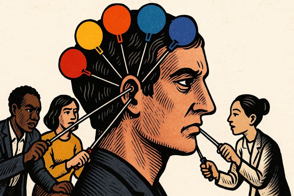
Color is the first thing you see, long before you read or tap. Red means danger or romance; blue, security or distance. Yellow shouts for attention, but too much exhausts. Marketers know this instinctively. When fast food chains chase hunger, they flood menus with warm reds and golds. A banking app swaddled in blue soothes your nerves, even when your balance sags. There’s no neutrality in color—every shade is a whisper to your subconscious, guiding actions before you have time to question why.
The most iconic brands owe their power to palette. Think of Tiffany’s robin-egg blue box, or the deep purple of Cadbury, each shade fiercely defended and never accidental. You feel this yourself: standing in a pharmacy, scanning dozens of similar bottles, your hand goes to the color you trust. Color is a shortcut for decision. Designers exploit this with skill, crafting journeys where every button, alert, and background is a subtle nudge.
Yet colors misbehave. They shift in meaning across borders and cultures. White means purity in one country, mourning in another. In Japan, pink signals youth and spring; in the West, it’s loaded with gender and nostalgia. You notice this when a product launches worldwide and sparks confusion or backlash over a palette choice. The lesson: color is local and global, always in negotiation with context.
Psychologists have long tracked the way color hijacks your mind. Studies show that warm colors boost urgency, cool tones foster calm. But numbers miss the point—real power comes from lived experience. Lina, a visual artist from São Paulo, once overhauled a government site’s navigation after noticing that local users, raised on bold carnival hues, ignored pale blues as “background noise.” With one swap, engagement jumped, not because the layout changed, but because the colors finally spoke the right language.
You see this in product launches, too. When a health app in Nairobi added rich greens and vibrant oranges to mimic market stalls, sign-ups doubled. Color, more than layout or text, signals belonging. You don’t need to understand the code—you feel it. That’s why luxury brands guard their signature tones, and startups agonize over which shade of teal feels “safe” versus “forgettable.”
Color also shapes mood and memory. The famous Google logo test—shuffling through 41 shades of blue—became legend for a reason. Users lingered a fraction longer, clicked a little more, or trusted an unfamiliar button, all because of a barely perceptible tweak. Designers, armed with heatmaps and intuition, learn that every pixel’s hue can tip the balance between delight and frustration.
Yet the power of color is never absolute. It changes with context—lighting, device, time of day, even your mood. Designers learn to test, adapt, and sometimes just surrender to the unpredictable. A campaign that dazzles on Instagram can flop in print, or vice versa. The trick isn’t to chase “perfect” color, but to notice what works, for whom, and when.
The best designers use color to tell stories. A weather app starts with sunny yellow, then sinks to stormy gray. A sports brand builds excitement with neon, then calms shoppers with earthy green. Every transition is a chapter, each shade a feeling in disguise. The world’s most memorable campaigns linger because of the colors they leave behind in your mind.
The danger is manipulation. Color can delight, but it can also deceive—think of wellness apps that use soothing pastels to distract from invasive data practices, or political ads that hijack patriotism with flags and banners. You need to read between the lines, noticing when color is invitation and when it’s distraction.
Still, when wielded with care, color is magic. It unlocks trust, sparks action, and brings joy to the everyday. It’s the reason some brands are loved and others fade away. As you swipe, tap, and scroll through the day, remember: the colors aren’t just there to decorate—they’re working on you.
In a silent gallery, a single painting radiates, casting its hues across awed faces. Each visitor lingers, drawn to something ancient, unspoken, and shared—a silent conversation in crimson, cobalt, and gold. A curator stands aside, wondering which shade will follow each guest into their dreams. And you—will you notice the colors guiding your choices, or let them slip by, silent but powerful, one shade at a time?
