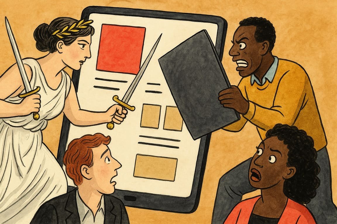
A grand gallery once admired for its marble columns and golden trim now draws only puzzled looks. Patrons wander, drawn by vibrant paintings, but stumble over cryptic signs, hidden exits, and a staircase that loops back on itself. This is not a metaphor for lost tourists, but for every digital product built on beauty alone—a stunning interface that leaves users stranded, longing for clarity over spectacle. In every pixel and shadow, the silent war between gorgeous visuals and simple function rages, rarely declared but always felt.
In digital design, the temptation to chase applause for aesthetics is almost primal. Portfolio sites explode with glossy gradients, interactive flourishes, and cinematic scrolls that hypnotize at first glance. Yet in the background, frustration festers. Users want to finish tasks, not marvel at transitions. The most beautiful interface is worthless if nobody can find the checkout button. Just ask the new-wave fashion label whose site won design awards but posted record-high cart abandonment rates, prompting their head of product to confess, “We built a museum, not a store.”
You’ve experienced the conflict in your daily digital life. Maybe you tried to book a flight and found yourself lost in a maze of sliders, carousels, and full-bleed images. The site looked like a Vogue spread, but where was the booking form? The struggle is universal: designers want to impress, but customers want to move on. The brands that survive are those that remember the journey, not just the view.
When Apple’s skeuomorphic era faded, critics lamented the loss of texture and warmth. Yet what emerged—a cleaner, flatter interface—ushered in an age where simplicity itself became desirable. But even minimalism, left unchecked, has its pitfalls. Monochrome palettes and oversized white space often leave users cold, wondering where to click next. Every decision to favor beauty or utility tips the balance between delight and despair.
Theoretical frameworks abound, but nothing speaks louder than failure. A luxury auto brand famously invested millions in a digital dashboard, hiring celebrated artists to design the interface. The result, a breathtaking visual, frustrated drivers with hidden controls and mysterious icons. A recall followed. “We forgot we weren’t building for a gallery,” the project lead admitted in a leaked email.
Usability evangelists argue that design is service, not self-expression. They champion invisible interfaces, frictionless flows, buttons that never make you think twice. Their heroes are sites like Craigslist—ugly, yet indispensable, proof that usefulness will outlast any trend. Still, the creative soul rebels against the tyranny of utility, insisting that beauty itself inspires engagement and trust.
You see this battle in the wild every day. Fitness apps, dating platforms, online banking—each tries to walk the line between stunning and simple. Some stumble spectacularly. The dating app Iris launched with lush illustrations and animated clouds, only to discover users missed crucial notifications and misread matches. Within months, the visuals were stripped down. Users returned, lured not by beauty, but by the comfort of clarity.
But does utility always have to win? Not according to Lara Zhou, creative director at Aurora Studios: “The most memorable experiences are beautiful and easy, never just one or the other.” The best design is a conversation, not a compromise—a moment where pleasure and purpose merge. Yet reaching that harmony requires humility. Designers must listen to users, not just their own ambitions.
This struggle is ancient. Think of architects who build grand cathedrals only for worshippers to trip on marble steps. Or chefs who serve artful dishes that no one dares eat. In every craft, the urge to impress collides with the need to serve. Digital products, fast-moving and feedback-rich, just make this conflict impossible to ignore.
Brands that crack the code earn fierce loyalty. Notion, the productivity tool, balances its clean aesthetic with intuitive controls, winning legions of fans who feel both cared for and inspired. Each tweak and update is met with cheers or jeers—a testament to how closely users watch the ongoing battle.
Some companies go further, enlisting real users as co-designers. At Wave Health, patient feedback drove a redesign that banished confusing icons in favor of clear labels. Their engagement soared. The lesson: in the war between beauty and usability, the only casualty should be arrogance.
There’s a risk in overcorrecting, though. Too much focus on utility breeds dullness, sameness, and eventually, apathy. You scroll through site after site, seeing the same safe layouts and predictable palettes. The digital world starts to feel like a beige waiting room—efficient, but forgettable.
A solitary designer stands before a towering, half-finished mural, brush poised in the evening light. They hesitate, sensing the watching crowd. Each stroke will either invite awe or confusion. The mural, like every interface, waits to prove that function need not bow to beauty, nor beauty to function. Shadows stretch across the floor, hinting that the boldest creation lies not in either extreme, but in the fragile space between. So, will you chase applause or enable action—or can you finally have both?
