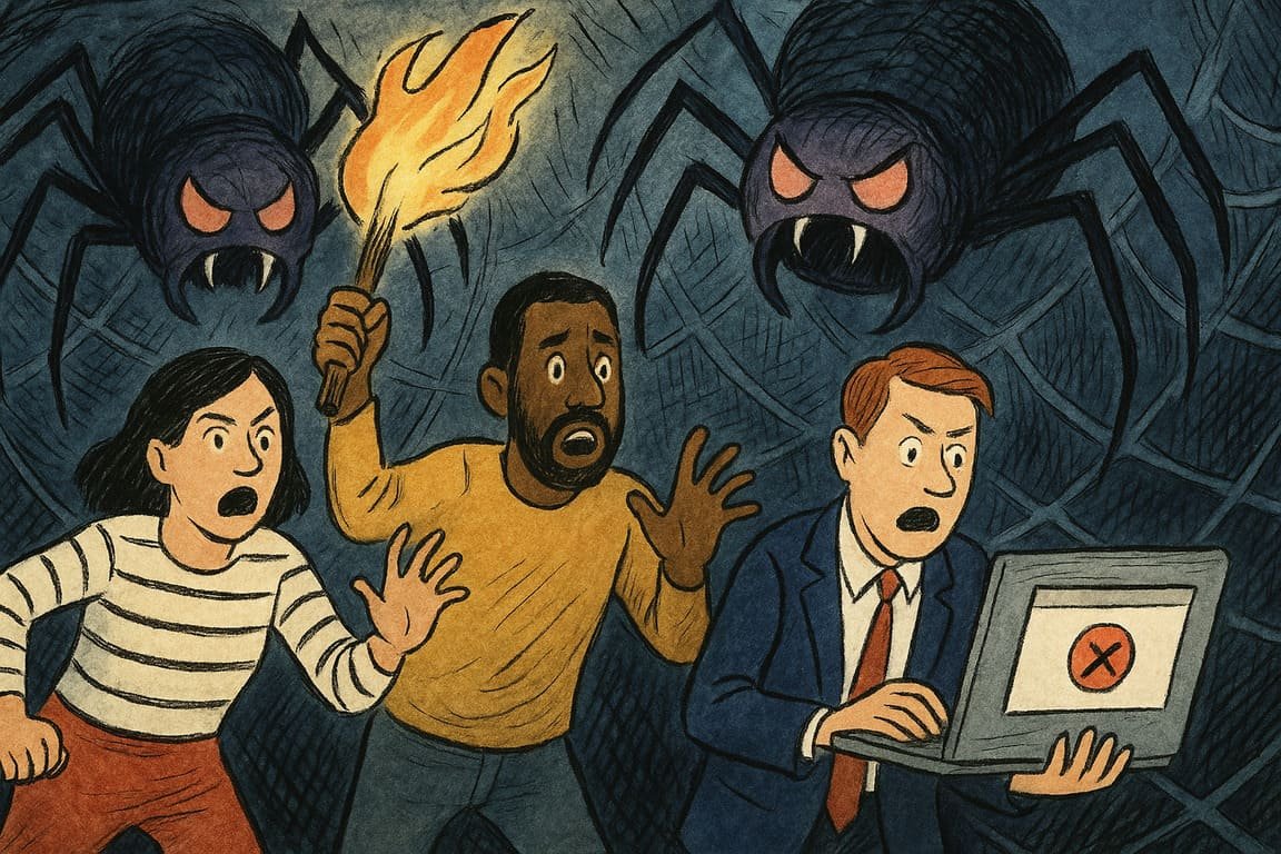
A city pulses with after-hours energy as thousands of digital storefronts compete for attention beneath the fluorescent haze of cyberspace. Inside a small office, a web designer rewrites code, sweat beading under the glare of dual monitors. Beyond the hum of servers and the ritual sips of cold coffee, a deeper anxiety settles in: one design mistake can empty a room faster than a fire alarm. Nightmares in web design do not howl—they lurk, quietly bleeding traffic and trust away until a website’s heart beats slower with every passing hour. For every site that thrives, a dozen more vanish into oblivion, casualties of traps set by their own creators.
These traps often appear harmless at first. Too many designers chase the latest visual trends—neon gradients, parallax scrolls, animated hamburger menus—believing style alone will lure visitors. Yet each flashy choice adds friction. Visitors arrive with intent but get lost in a maze of auto-playing videos and aggressive pop-ups. Every extra click becomes an obstacle. What started as innovation turns into sabotage.
Slow load times remain the most insidious nightmare. You have likely felt that sinking frustration, thumb hovering over a spinning loader, seconds stretching into infinity. Users are ruthless. If your site stalls, they vanish. Even the most loyal fans abandon ship when a homepage lumbers under the weight of bloated images or poorly optimized scripts. The traffic loss is quiet, almost surgical—an exodus with no warning.
Confusing navigation haunts websites in every industry. A restaurant buries its menu three clicks deep. A retailer splits its checkout into a labyrinth of forms, each with cryptic error messages. By the time a visitor finds what they need, their patience has evaporated. One local bike shop learned this the hard way, losing hundreds of online orders until they replaced their drop-down chaos with a single, clear call-to-action button. Conversion rates soared overnight.
The mobile experience, too often an afterthought, becomes a graveyard for good intentions. Sloppy responsive layouts, tap targets too small, or text that shrinks to unreadable whispers send would-be customers fleeing. When a fashion startup in Lagos ignored mobile users, sales stagnated. Only after investing in a dedicated mobile-first redesign did engagement rebound, breathing life back into a fading brand.
Another subtle trap: inaccessible design. Color schemes that blend text into the background, missing alt text on images, or unlabelled buttons quietly shut out users with disabilities. One global news site faced a social media firestorm after readers discovered headlines unreadable to screen readers. The fix was simple, but the reputational cost lingered. True accessibility is not just compliance. It is respect.
SEO disasters can be invisible killers. Designers obsessed with aesthetic perfection sometimes bury headlines in images, neglect meta tags, or forget to optimize for search. Their beautiful work becomes a digital ghost town. A tech blog once watched organic traffic plummet after a redesign hid crucial keywords behind sliders. Only a painful audit—and a return to fundamentals—saved their audience.
Poor content hierarchy leads visitors down blind alleys. When calls to action fight for attention or crucial information hides beneath the fold, users lose their way. At one SaaS company, support tickets piled up until the team realized customers could not find the “Get Help” button on their own dashboard. A single redesign, placing help front and center, cut complaints in half and turned lost users into loyal fans.
Autoplay videos and background music startle more than they impress. A travel brand lost its millennial audience when a dreamy intro video hijacked every landing, blasting sound in quiet offices. The bounce rate spiked, and social ridicule followed. The lesson: never ambush your visitors. Let them choose their journey.
Ads and pop-ups, when overused, transform sites into obstacle courses. A respected finance magazine lost its audience’s trust by plastering every page with aggressive interstitials. Even loyal readers found themselves fighting to close ad windows, each encounter eroding the brand’s credibility.
Broken links and 404 errors erode confidence with every click. For a nonprofit raising funds, a dead donate link meant lost opportunities that never return. Every broken path is a silent message: this site cannot be trusted.
Most haunting of all: the slow, invisible creep of irrelevance. When a website stops evolving, traffic quietly drifts elsewhere. A once-vibrant community platform faded into obscurity after failing to adapt to users’ changing needs, watching as discussions migrated to sleeker, faster competitors. Innovation is not just a feature—it is the soul of survival.
The night deepens and the office glows with the blue light of a site relaunch. Fingers hover over the keyboard, one last check before releasing the site to a waiting world. Outside, the digital crowd surges and scatters, seeking the path of least resistance. Somewhere between a perfect layout and an overlooked bug, the fate of traffic hangs in the balance.
Every designer will face these traps. The true question is whether you will recognize the nightmares before they kill your momentum, or sleepwalk into the same old mistakes. Will you shine a light on every shadowy corner of your site, or watch in silence as your traffic disappears?
