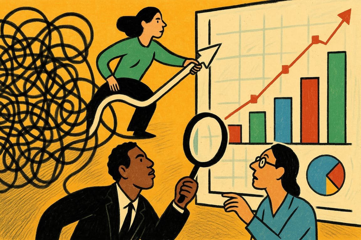
Rows of blinking monitors cast blue shadows on a cluttered desk where a weary analyst chases meaning through an endless jungle of spreadsheets. The air tastes metallic, thick with tension. Across the room, a team huddles over a whiteboard scrawled with cryptic graphs, each mark another attempt to force order from chaos. Here, in the hush between the last keystroke and the next big decision, a miracle happens. Data transforms, shape-shifts, sheds confusion, and begins to speak. Visuals become bridges—suddenly, the numbers breathe.
If you’ve ever squinted at a wall of raw data, you know the feeling. It’s not just information overload; it’s the creeping sense that somewhere inside the mess, a pattern hides—elusive, mocking, important. Yet every once in a while, a bold visualization slices through the fog. Consider Florence Nightingale, who turned grim hospital statistics into a rose diagram that changed battlefield medicine forever. Her graphics didn’t just inform; they demanded action.
Modern business lives and dies by how well it tells its story. Charts, infographics, dashboards—each a window into worlds that would otherwise remain locked away. When Hans Rosling animated global health data in his TED talks, he didn’t just teach; he woke up the world. Data, rendered right, makes believers out of skeptics and inspires decisions that shift entire industries.
You stand at the crossroads of possibility and paralysis. Spreadsheets whisper doubt, but visuals sing with hope. A single chart can tip a meeting from confusion to consensus. The difference between success and failure isn’t always the numbers themselves, but how courageously you translate them. Think of Steve Jobs, launching the iPhone, using stark visuals to cut through complexity. He made the unfamiliar feel inevitable.
Real change starts when data comes alive. There’s power in a color-coded map that reveals hidden opportunity, in a dashboard that pulses with real-time progress, in a timeline that turns the past into a roadmap for the future. Companies like Airbnb grew from side projects to global disruptors by visualizing trends their competitors missed. When you see what others ignore, you win before you even begin.
Every memorable data story carries a spark of rebellion. A young researcher at a climate nonprofit used interactive maps to show local policymakers how rising temperatures threatened specific neighborhoods. The graphics went viral, driving real policy change. It wasn’t the data that convinced city hall; it was the way the story unfolded visually—personal, urgent, unforgettable.
You don’t need to be a statistician to wield this magic. The real secret lies in empathy. Ask what your audience needs to see, not just what you want to show. Strip away the jargon, highlight the pain points, and paint a clear picture. Data, at its best, is an act of translation, not just calculation.
Think of brands like Spotify, which use personalized data visuals to wrap up each listener’s year in color, animation, and memories. That’s not just marketing; it’s a masterclass in turning information into identity. People crave stories, not spreadsheets. They remember what they can see, touch, and share.
Visuals democratize knowledge. When the pandemic hit, dashboards by Johns Hopkins and others became lifelines, helping millions track an evolving crisis. In boardrooms and bedrooms alike, these visuals provided clarity, reassurance, and urgency—sometimes all at once. The most powerful insights are useless unless they reach the right people in a way they can understand.
Behind every elegant chart lies a battlefield of trial and error. Mistakes are part of the journey. IBM’s early attempts at business intelligence often produced overwhelming dashboards. It took years of tinkering to arrive at today’s streamlined, actionable interfaces. The lesson? Clarity is earned, not given.
A great data visualization doesn’t just reveal what’s already known; it exposes blind spots. A nonprofit mapping food deserts discovered gaps in their outreach when a simple map showed neighborhoods slipping through the cracks. That single visual transformed their strategy overnight.
You have more tools now than ever. From Tableau to Google Data Studio to Canva, today’s innovators can turn raw numbers into revelations with a few clicks. But don’t be fooled: the tech is only as powerful as the questions you ask and the courage you show in telling the truth, beautifully.
To visualize data is to translate reality. Done right, it’s an act of generosity—inviting others into understanding, sparking debate, and driving action that ripples outward. The world needs fewer wizards and more translators, fewer gatekeepers and more guides. That’s how complexity becomes clarity.
A lone chart glows in a darkened conference room, its lines twisting like neon on midnight asphalt. In this silence, the future waits to be recognized, its story encoded in shapes and color. The right image at the right time can upend assumptions, open eyes, and change lives.
You have the power to make the invisible visible—so what truth will you show the world next?
