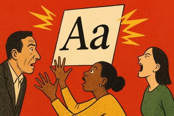
At the edge of a silent, rain-soaked avenue, an old typewriter sits perched on a modern glass table, its keys gleaming under the lamplight. An ad agency’s creative director, Mira, hovers over it, testing fonts like a sommelier sniffs wine. She selects one, types a single word, and the air changes. Outside, neon signs and digital billboards jostle for attention, but it’s the typeface on a single café window that stops people in their tracks. No booming music, no viral mascot—just the weight of a well-chosen font. Here, design does not shout. It leans in close, whispering stories that climb straight into memory and refuse to leave.
No one talks about the quiet power that fonts wield in the brand wars, yet every scroll through your phone proves their sway. Why do you feel a jolt of nostalgia when you see a classic serif, or an urge to click when bold sans-serif letters appear in an app notification? It isn’t chance. It’s the outcome of an invisible tug-of-war, a strategic selection that can make or break a business’s fortunes. Apple’s minimalist typography signals clarity and trust, while Netflix’s chunkier font builds anticipation. Even the world’s biggest brands know: a font is not just a tool, it’s a voice.
You sense it when you order coffee. The hand-lettered script on your cup says “homemade warmth.” You visit a pharmacy with Helvetica signs, and something about those neat, clinical lines calms your nerves. Each font choice carries emotional charge, sometimes louder than the product itself. Mira remembers a campaign for a nonprofit: they swapped generic fonts for a playful rounded typeface and donations shot up. “We didn’t just change the look,” she tells her team, “we changed how people felt about giving.”
Every time you open an app or sign a contract, you’re nudged by these hidden signals. Fonts frame your expectations, set the mood, and cue you to act. The explosion of direct-to-consumer brands brought a typographic renaissance—companies raced to own unique, proprietary fonts, each calculated for maximum stickiness. Airbnb’s friendly, rounded type welcomes travelers, while Supreme’s aggressive, all-caps logo feels urgent. Brands aren’t just selling services; they’re selling feelings, with fonts as their delivery system.
Font stories don’t stop at the logo. They ripple through every touchpoint: website, email, packaging, receipts. You might not recall the name of a niche candle brand, but you remember their slender, dancing letters that make every box feel like a gift. In retail, a startup’s fortunes can turn on the decision to switch from an awkward script to a confident sans. Even on menus, typeface choices push diners toward specific dishes or set the tone for a luxury splurge.
Hidden behind the art, science drives these choices. Eye-tracking labs, A/B testing, and field studies reveal that font legibility, kerning, and weight can swing engagement rates and purchasing decisions. Still, the best designers break rules to leave their mark. When a tiny Kenyan juice stand rolled out a typeface inspired by local street art, it sparked conversations, selfies, and queues that lasted till midnight. Sometimes a font isn’t just a brand choice—it becomes a city’s unofficial symbol.
Designers swap stories of the times typography won the day. A digital news outlet doubled its subscriber base after overhauling its fonts for mobile readers. Meanwhile, a legacy fashion house reignited relevance among Gen Z with nothing more than a fresh headline font. As one designer, Evan Cheng, put it, “People remember shapes, not names. Fonts are the new handshake.” He’s right. The font you choose is the handshake your brand offers the world—a first impression with lasting consequences.
Across the globe, entrepreneurs are using fonts as rallying cries. In Lagos, a microbrewery paired blocky, playful letters with local slang, instantly setting itself apart in a crowded scene. In Tokyo, a plant store’s delicate brushstroke font turned routine purchases into contemplative rituals. The right font triggers identity, nostalgia, or even rebellion, depending on the day.
If you doubt the magic, look at any viral meme or global campaign. Fonts become memes, subcultures, protest tools. Remember how Comic Sans became an ironic badge of internet protest? Or how Black Lives Matter posters drew power from assertive, all-caps type? Font choices say what words alone cannot: urgency, warmth, confidence, mischief.
In the end, fonts function as the ultimate secret code. They signal “for you,” or “not for you.” Some fonts whisper exclusivity, others shout inclusivity. Shoppers may not read this consciously, but their instincts catch the message. The best marketers know: fonts are emotional fingerprints, branding that sticks to the soul.
Brand leaders who get this right don’t just sell—they shape how their message lands, how trust forms, and how communities gather around shared signals. When words whisper, brands roar. The volume is set by the letters themselves, not the copywriter’s ambition.
Through frosted glass, the city’s hum recedes as Mira’s typewriter falls silent. She scans her work, knowing a single tweak in font will ripple out into a hundred thousand micro-decisions. Outside, shoppers pause at signs, strangers share jokes over quirky menus, a couple chooses a bar because the letters in its name feel like a promise. The world does not hear the whisper, but it answers.
You notice the next word you see on a sign, feeling the subtle spark that says, “this was made for you.”
