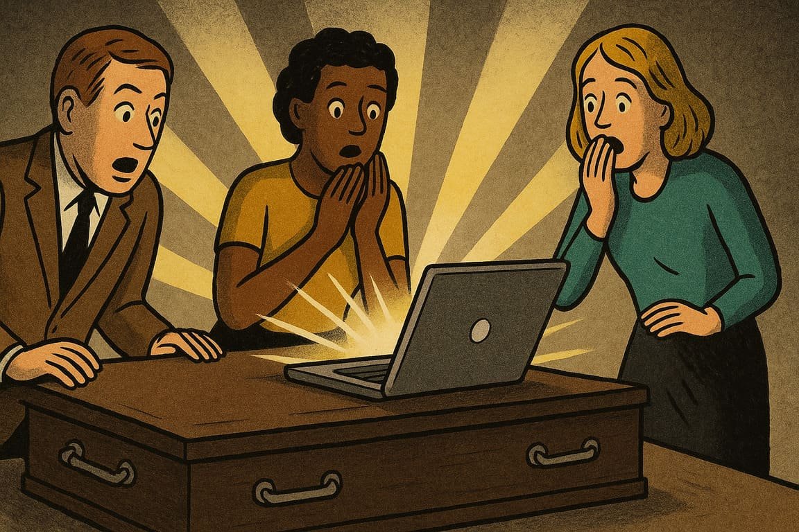
The night buzzes in a co-working loft as web developers huddle around a single glowing monitor. Outside, streetlights flicker and buses rattle by, but inside, the tension is electric. The screen shows a homepage stripped bare—no carousels, no pop-ups, no sprawling menus—just bold headlines, clean space, and a single call-to-action pulsing at the center. The team’s faces reflect curiosity and a hint of panic. Is this really enough? With every pixel removed, an old fear returns: will anyone stay? Yet as midnight slides toward morning, a quiet thrill spreads. The website feels awake, alert, almost alive. The reboot of simplicity has begun, and nothing will be the same.
On the other side of the city, a boutique retailer faces dwindling online sales. The founder, exhausted by endless updates, takes a radical step. She deletes half her site—slashing pages, ditching plugins, banishing clutter. What remains is a soft palette, oversized buttons, and product images that breathe. Orders double within a month. Customers write, “Your site is just easy.” The team learns that simplicity is not a downgrade, but a force that clears the way for loyalty.
Designers everywhere chase this awakening. For years, “more” was the unspoken mantra—more features, more graphics, more words. Complexity crept in, turning simple websites into obstacle courses. Then, a new breed of web hero emerged. Armed with empathy and data, these rebels started deleting, refining, and rearranging. Suddenly, users found what they needed in seconds. The silence after the noise became the real invitation to engage.
You know the difference instantly. On a cluttered site, your eyes dart, your patience thins, your trust shrinks. But when you land on a site where everything flows, you feel relief—sometimes even delight. There’s space to breathe, clear direction, and no guessing. The best part? You get what you came for, quickly and without stress. That’s the secret the world’s leading brands keep guarded: Simplicity isn’t about looking minimal. It’s about working better.
Stories of the simplicity reboot are spreading. A local nonprofit rebuilt its entire site on a single page, using big photos, crisp text, and nothing to distract from its mission. Donations soared. A SaaS startup switched from a labyrinth of features to one streamlined dashboard. The result? Fewer support tickets and a spike in positive reviews. The lesson is universal: When you make things easy, people move forward—fast.
The science behind this trend is as old as psychology itself. Human brains crave patterns, rhythm, and order. Cognitive overload drives people away; clarity keeps them hooked. That’s why Google’s search bar, with its iconic blank expanse, beats portals stuffed with news and links. When users see simplicity, they sense respect for their time and intelligence.
Even giant brands have risked everything on a simplicity reboot. IKEA, famous for sprawling catalogs, launched a “one product, one page” campaign. The backlash was instant, but sales hit records. Their head of digital said, “We bet on focus and won.” That’s the paradox: The bolder your simplicity, the more dramatic your results.
Fictional web developer Riko Sanchez tells his junior team, “Clutter is cowardice.” He recalls a client who insisted on cramming the homepage with features. The site bombed. Months later, Riko deleted every non-essential element, leaving just a single image and three links. The conversion rate soared, and the client became a believer. His motto hangs above the team’s workbench: “If in doubt, cut it out.”
There’s magic in the math of simplicity. Fewer elements mean faster load times, lower bounce rates, and better mobile experience. But the true reward is emotional: Users feel smart, powerful, in control. They don’t have to ask for help or hunt for answers. They remember the ease—and they return.
The simplicity reboot also signals a cultural shift. As remote work, endless notifications, and digital noise overwhelm daily life, people crave places that feel like an oasis. The brands that offer rest, clarity, and delight win trust. Simplicity isn’t a style; it’s a promise: You matter more than our cleverness.
Still, the reboot takes courage. Teams must battle old habits, resist the urge to explain, and trust that clarity will do more than complexity ever could. The future belongs to designers willing to clear the fog, lift the weight, and let the work breathe. Web design’s secrets have awakened, and their power is growing.
This movement is not about less for its own sake. It’s about what you unlock when the noise is gone: focus, action, loyalty, and love. Simplicity’s reboot is a rebellion with staying power, and those who join will shape the new internet.
A silent office hums at sunrise. Coffee steams beside a keyboard, while the glow of a simple homepage reflects in the window. There’s no chaos, no distraction—only direction and calm. Visitors arrive, linger, act, and remember. The old ways of web design seem distant, almost embarrassing. What remains is pure, and it works.
A freelance designer steps back from her latest launch, heart pounding. The client grins: “You made it easy.” In that relief, a new loyalty is born—not from flashy tricks, but from a site that honors the user’s time.
You have a choice each time you build, click, or design: chase more, or trust in less. The biggest secret? Simplicity, when awakened, is the loudest voice online.
