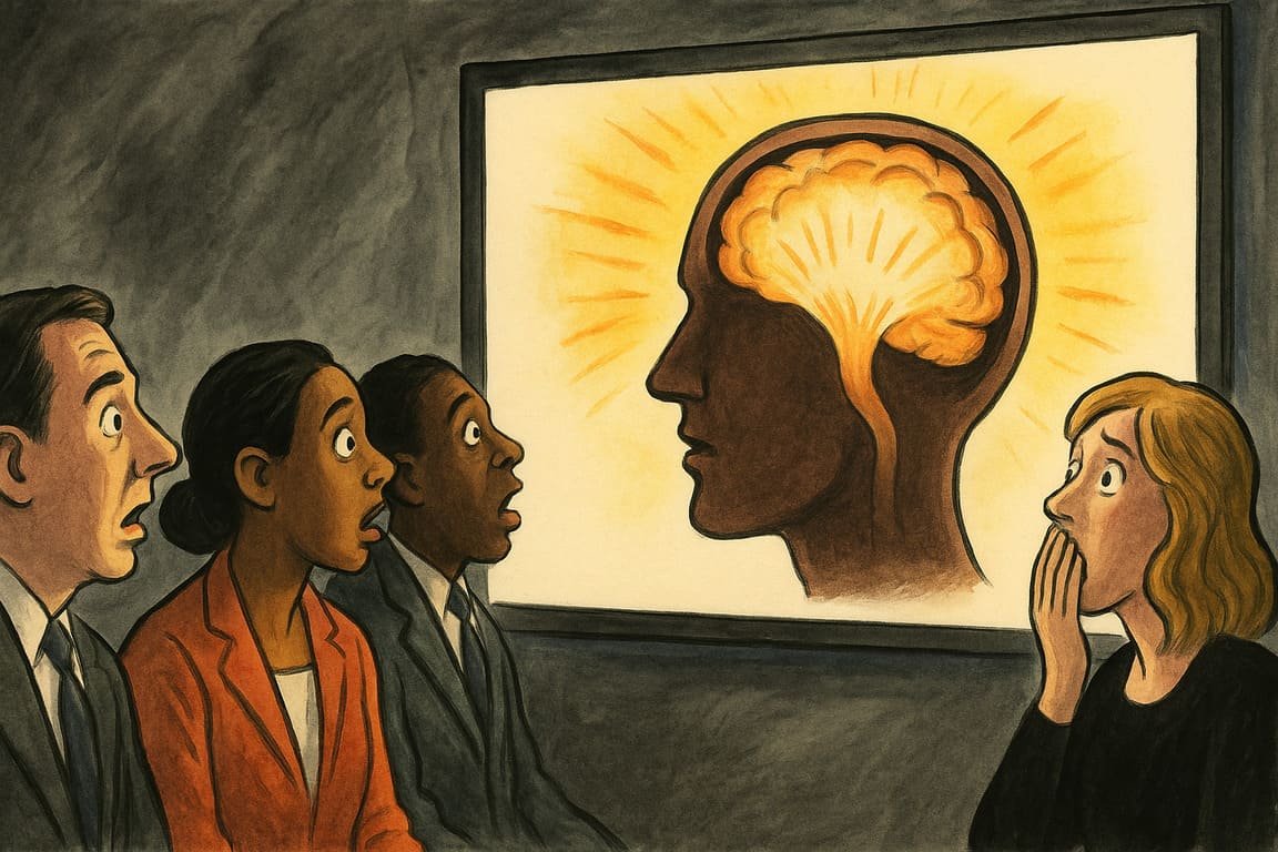
The conference room hums with fluorescent unease, every seat filled by restless professionals shifting in anticipation. A single projector beam slices through stale air, illuminating the wall with an image so sharp it feels like prophecy. The opening slide lands not as a formality but as a jolt, colors calibrated to command attention, type blaring purpose like a band at the apex of a world tour. Heads rise, posture straightens, and for a rare moment, nobody glances at their phone. The collective expectation is visceral. Here, PowerPoint is not a groan-worthy routine. Tonight, slides possess a strange authority. Each transition flickers across faces, rewiring the mental circuits of those present. By the end, minds open, long-held beliefs slip, and even the most skeptical audience gasps in the glow of design-driven revelation.
PowerPoint was never intended for miracles. Early users saw little more than electronic index cards. Yet, in the hands of design disruptors, the tool became a theater for the mind. At a London startup event, a little-known founder, Rosa Patel, unveiled her pitch: each slide unfolded like a graphic novel, rich with metaphor, story, and unexpected movement. Investors later confessed that they had remembered every key insight. Their brains, they claimed, “felt different—like you woke up in a new company.”
You can feel that shift. When graphics move beyond bullet points and cheap clip art, your brain sits up. Recent workshops at RainWorks, a creative agency, focused on hacking cognitive habits. Designers orchestrated slides with subtle patterns and bold contrasts, playing on memory’s tendency to cling to novelty and repetition. Employees walked out dazed but excited, recalling facts they’d missed in a year’s worth of reports.
It is not magic. It’s how the brain works. We are wired to tune out sameness and lock onto surprise. PowerPoint, abused, will lull the crowd to sleep. Used wisely, it breaks the trance and makes knowledge stick. Neuroscience reveals that graphics paired with rhythm—short sentences, bursts of color, pauses—lock into working memory. At a Berlin fintech conference, a designer named Julian Lenz flashed one bold graphic every two minutes, letting silence punctuate the message. Feedback spiked, with participants repeating his tagline days later. The brain remembers a punchline.
Stories matter as much as style. You cannot rewire an audience with data dumps. Instead, imagine revealing a customer’s transformation, one slide at a time. At a healthcare summit, consultant Raj Singh wove a patient’s recovery into the deck: MRI scans, quotes, a photo diary. By the finale, half the audience wiped away tears. Real stories, real images, real results.
Clarity outshines complexity. Audiences flinch at crowded slides. Keep visuals crisp, text minimal. Take the advice of Meera Tiwari, whose consulting pitch in Mumbai flipped the script: every key metric received a single, powerful slide, illustrated with hand-drawn icons. She reported winning deals with clients who felt “refreshed, not overwhelmed.” Sometimes what’s missing has the most power.
Animation and pacing reset attention. At a recent Paris design hackathon, co-founder Elise Morel used subtle slide movement—arrows that glided, charts that unfolded—to guide the eye and mind. The technique, she explained, “mimics natural curiosity.” Attendees felt as if they were led, not forced, through ideas. The result: nobody left the room.
Color is a quiet manipulator. Warm tones signal urgency, cool shades slow the pace. David Kim, a branding expert, treats every presentation as a mood board. At a corporate offsite, he swapped traditional palettes for soft gradients and deep contrasts. The crowd buzzed with excitement, trading color theories after the meeting. A memorable slide, like a favorite song, lingers in your mind.
Dialogue invites connection. Ask a question, drop a poll, let a comment hang on the screen. During a live pitch, Maya Fischer paused for a single word—“Why?”—hovering over a dramatic image. The room leaned forward. Every eye watched for the answer, rewiring anticipation into curiosity.
Icons, not jargon, carry weight. In a high-stakes engineering pitch, Anna Kova replaced technical text with custom icons. Confusion gave way to “aha” moments, engineers nodding as complex ideas became visible, not just spoken. The next day, the firm secured its largest-ever contract.
The closing slide is your encore. Too many presenters fade out, hoping applause will fill the silence. The best finish with a question, an image, a challenge. At a global leadership summit, Jonathan Wei ended his talk with a photograph of his grandmother’s hands holding an empty teacup. The audience stared in silence, pondering the story behind the picture. It became the unofficial theme of the conference: legacy and learning.
Design does not replace substance. Slides are not spells. But in a digital age overflowing with noise, those who design for brains, not just eyes, create moments that last. You are not just delivering information; you are bending memory, shaping emotion, wiring new paths for the mind to wander.
In the aftermath, chairs scrape and conversations tumble out the door, but something electric lingers. The projector hums, the last image frozen on the wall, and people move a little differently. They’ve witnessed more than a presentation—they’ve felt their brains tuned, their certainty shaken. The transformation sticks long after the room empties.
You will remember what you saw, not just what you heard. The question is: will you ever look at a slide—and your own ideas—the same way again?
