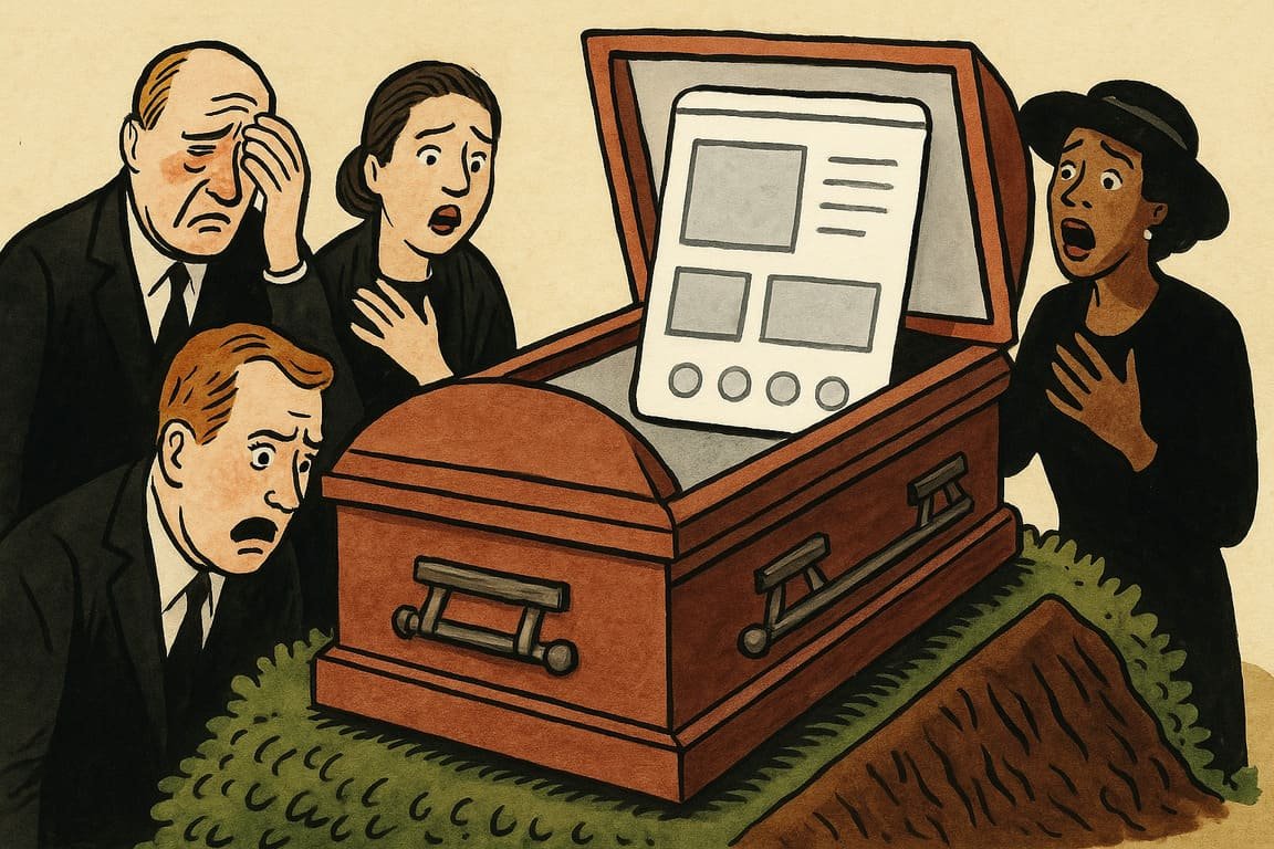
Rows of tablets glow in a crowded design studio, their interfaces stripped to bone—plain fields, ghostly icons, vast arctic spaces where textures once thrived. A creative director circles the room, haunted by the specter of flat design’s promise: effortless clarity, universal beauty. Once, these cold surfaces symbolized a revolution. Today, whispers of rebellion drift like smoke. Did flat design save user experience, or did it flatten something vital—killing joy for sterile efficiency?
Years ago, flat design erupted across the web, sending gradients, bevels, and skeuomorphism packing. Every product, from fitness trackers to banking apps, raced to conform. You probably remember the switch: colors muted, shadows gone, interfaces distilled into iconography so subtle it dared you to guess their meaning. Apple, Microsoft, and Google declared “less is more,” yet users weren’t always convinced. Social media buzzed with jokes about getting lost in minimalist menus. Real people, not critics, noticed that style had quietly stolen something from them.
Your daily scroll proves the paradox. Flat design delivered a clean, frictionless journey, but the soul sometimes went missing. Sure, speed improved and screens felt modern, but buttons became indistinct. You’ve tapped the wrong icon, hunted for a hidden menu, or wondered why an action felt so unsatisfying. The digital world grew efficient but dull—a monotony that sparked longing for even a hint of tactility or fun.
Behind the scenes, designers argue over what’s been lost. Flat design’s early advocates preached purity, but critics counter that the movement went too far, erasing personality and joy in the chase for “intuitive.” Olivia Santos, a veteran UX lead, quips at conferences, “I want my apps to have a pulse, not just a pulse line.” That yearning is spreading.
The backlash has already begun. Big brands experiment with “neumorphism,” injecting soft shadows and subtle gradients for a tactile twist. Others revive retro touches, mixing playful cues with flat layouts. Instagram’s latest update, for example, quietly brought back shadows and depth, drawing applause from users who felt their thumbs finally knew what to press. The pendulum swings—perhaps it always must.
Stories circulate of startups rising by going against the grain. One Berlin fintech soared to cult status by embracing bold colors and chunky, unmistakable buttons. Users didn’t just find their features—they felt at home. Their founder, Max Kohler, credits the growth to “making the interface feel like an old friend, not a hospital room.”
You may have seen the “flat fatigue” reflected in your own preferences. When every product looks the same, brand loyalty frays. Designers worry about losing emotional connection. In a world of perfect rectangles, even the smallest quirk—a friendly animation, a splash of neon, a little personality—can win hearts. The secret sauce isn’t minimalism for its own sake, but the courage to be memorable.
The flat design era revealed another problem: accessibility. Without visual cues like shadows or highlights, some users struggle to distinguish interactive elements. Accessibility advocates have pushed for more contrast, clearer feedback, and tactile cues—reminding everyone that clarity and inclusivity must walk hand in hand. Fail at this, and your product excludes more than it welcomes.
Flat design isn’t dead, but it’s mutating. Now, hybrid styles emerge, blending efficiency with delight. Creative teams test bolder colors, animated micro-interactions, and thoughtful layering. The goal: deliver the speed and clarity of flat design without starving users of pleasure. Spotify’s motion design lead, Sasha Green, describes the challenge as “giving back the joy, pixel by pixel.”
You sense that the future will favor bravery. The era of copycat minimalism is fading, replaced by a hunger for originality. Successful brands balance utility and charisma, mixing the best of both worlds. The products that win feel familiar yet surprising, efficient yet unmistakably alive.
Every trend ends as a lesson. Flat design taught the industry discipline, but now the field is wide open for reinvention. Those who cling to the old ways risk fading into white noise, while those who experiment can shape the new era of digital joy. The flat design funeral isn’t an end, but an inflection point—a moment for creative rebirth.
On a quiet rooftop, a designer wipes rain from their screen, watching a skyline dotted with screens—each glowing, each alive with new color. The city pulses with the promise of rediscovered playfulness, as if every flat interface waits to burst into song. Somewhere, a forgotten button gleams, bold and tactile, reminding the world that joy and function can share the same pixel. So, will you keep everything flat—or dare to press for something deeper?
