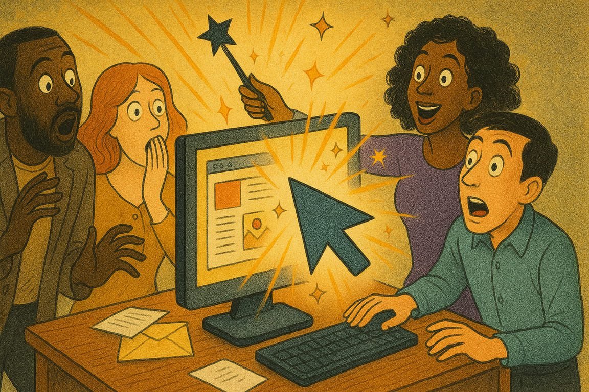
The city stirs before dawn, neon lights casting slow-moving rivers of color across high-rise offices. Somewhere in a cramped startup loft, a young marketing team waits breathlessly, eyes fixed on a dashboard tracking live clicks. With a single refresh, numbers surge—spikes, arrows, dots dancing up the graph like a jackpot win. The only thing that’s changed? A tweak in design. A color shift, a bolder button, maybe a graphic that feels too wild to ignore. Overnight, digital walls crumble. Quiet corners of the internet roar to life. This isn’t luck or chance. It’s the beginning of a click-through renaissance, driven by the most addictive magic of all: great design.
You’ve felt the pulse. That sudden urge to click, to explore, to say yes, all triggered by a design element you couldn’t ignore. Whether it’s a neon button, a scroll-stopping hero image, or a playful animated arrow, the urge is primal. Modern brands are obsessed with it. They invest in designers, storytellers, and visual alchemists not to win awards, but to win your attention for just one more second. Clicks are the applause of the internet—each one a small, addictive victory.
Think about how Duolingo transformed a grammar app into a cult phenomenon. Their mascot winks, dances, and occasionally nags in bright, meme-worthy graphics. Progress bars pulse with color. Achievement badges explode like confetti. Every element is designed to invite one more tap, one more lesson. Engagement isn’t a side effect—it’s the core strategy.
Mini-case study: Ava, a wellness coach, struggled to drive clicks from her newsletters. After months of bland layouts, she collaborated with a local illustrator for playful, hand-drawn CTAs. Suddenly, her open and click-through rates doubled. Clients replied with screenshots and emoji-laden thank-yous. Ava didn’t just redesign an email. She redesigned her audience’s mood.
Design is science and art. It’s knowing that red buttons spark urgency while blue builds trust. It’s experimenting with micro-animations, drop shadows, and whitespace to steer the eye without ever shouting. Netflix, for example, found that simply changing their preview thumbnails to feature faces looking toward the viewer (instead of away) sent clicks soaring. Subtle, human cues unlock digital magic.
Mobile has changed the rules. A click now happens on a screen the size of your palm, so design must be even sharper. Instagram built an empire on the principle of thumb-friendly navigation: giant tappable zones, bold icons, and seamless transitions. If your site or email stumbles on mobile, your click-through dreams end in the gutter.
Great design isn’t just about beauty. It’s about creating pathways, not roadblocks. Amazon’s one-click purchase button rewired e-commerce because it stripped away friction. Each click felt effortless, almost inevitable. That’s the secret sauce: remove hesitation, reduce thought, reward action. Design turns intention into reality.
Storytelling boosts every click. People don’t just want to navigate—they want to participate. Brands like Peloton fill their apps with motivational stories, progress maps, and personal records, all visualized to spark a “keep going” click. The difference between a dull experience and a viral loop is the design’s ability to connect action with aspiration.
Data is the hidden muse behind every great design. Teams test headlines, hero images, layout tweaks, and button copy. Airbnb’s growth team became famous for running thousands of A/B tests, learning that tiny changes—icon shapes, background gradients—could move millions. Behind every viral spike is a designer who obsesses over pixels and a strategist who reads the numbers like fortune-tellers.
Humor unlocks clicks. Sometimes it’s a quirky graphic or a meme slipped into the user journey. Remember when Slack snuck witty copy and easter-egg graphics into error pages? Users shared screenshots, laughs, and links. The right visual punchline can turn a dead end into a cult moment.
FOMO and curiosity are turbochargers. Countdowns, hidden rewards, “just unlocked” messages—these hooks are everywhere for a reason. Nike’s SNKRS app deploys surprise drops with visuals so urgent and mysterious that entire forums erupt in speculation. Design isn’t just about showing—it’s about hinting, teasing, provoking.
At the heart of every click surge is a simple truth: audiences respond to what feels alive. Flat, static, or predictable design fades. What’s dynamic, emotional, or just a little mischievous lights a fire. Clicks don’t follow logic—they follow a feeling.
As the sun sets and screens across the world flicker to life, dashboards tell the real story. There’s a magic moment when numbers jump and an audience feels seen, heard, and understood. Somewhere, a designer’s gamble has paid off, a marketer leans back in awe, and a million new stories begin. If your next design could make the world move, would you dare to try the unexpected, or play it safe and miss the surge?
