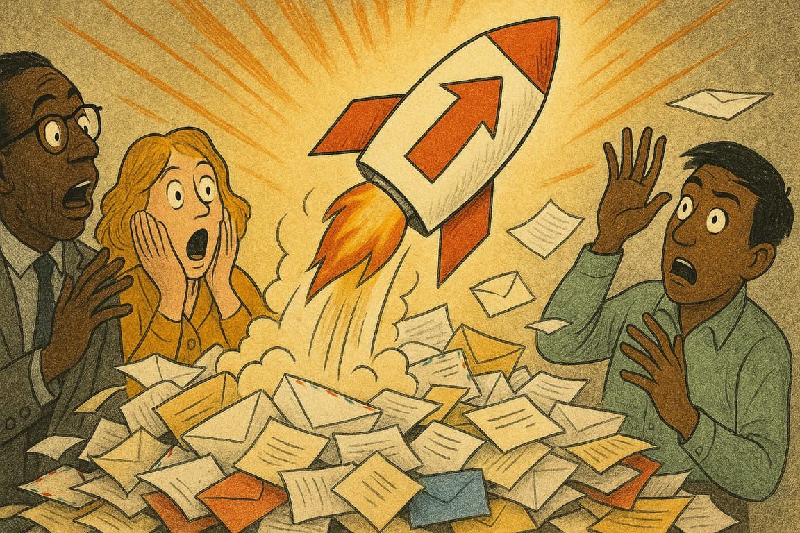
Early morning. An overworked marketer sips cold coffee, scrolling through a flooded inbox under the sterile buzz of fluorescent lights. A thousand unread emails blur into gray—except for one. It leaps out, vivid and strange, subject line daring, graphics crackling with life. A click. The story begins. In offices, bedrooms, and bustling subway cars across the world, that same email explodes like confetti, opening rates off the charts. Somewhere, a designer grins knowingly. The chaos isn’t a bug—it’s the magic that turns routine communication into irresistible drama.
You crave that moment—a digital drumroll as your email lands atop a teetering stack, yet instantly grabs attention. It’s not about luck or subject-line hacks. The real secret? Design that speaks first, text that follows. Each element, from header image to animated call-to-action, conspires to hijack your reader’s senses. Emails that crush the average don’t just inform, they seduce, tease, and entertain.
Consider the legendary rise of Glossier’s newsletters. Rather than templated promotions, each email is a visual adventure—playful photos, hand-drawn graphics, inside jokes, color palettes as carefully chosen as runway looks. Subscribers forward, screenshot, and gush on social. When design is this human, engagement skyrockets. You’re not pushing products. You’re creating moments people want to relive.
Case in point: Jamie, founder of a tiny indie bookshop, nearly quit email marketing after months of silence. One day, they sent a hand-illustrated “Choose Your Next Adventure” email, turning recommendations into a branching story. Replies tripled. Customers asked for posters of the artwork. Open rates soared. Jamie’s design wasn’t perfect—it was personal, and the chaos was the point.
Modern emails are kinetic experiences. Brands like Airbnb and Uber use dynamic graphics, personalized maps, and micro-animations to invite readers on a journey. Emails become interactive playgrounds, not billboards. The result? You don’t just glance, you linger. Engagement becomes addictive.
This is the era of mobile-first design. If your emails fumble on a phone—text that squints, buttons that hide, images that lag—you lose. The brands dominating open rates obsess over seamless mobile experiences. Starbucks nails this, serving emails as clean and bold as their coffee, no matter the device. Tiny touches make all the difference: thumb-friendly buttons, single-column layouts, text that pops against color.
Color psychology works wonders in the inbox. Strategic splashes of red prompt urgency, green soothes, yellow sparks curiosity. Spotify’s year-end emails explode in neon and black, a visual signature fans now anticipate. Your palette isn’t just decoration—it’s an emotional trigger.
Every click, swipe, or scroll is data. Smart teams treat email as a living lab, testing layouts, tweaking graphics, studying heatmaps. Netflix famously reshaped its binge-worthy recommendation emails with user feedback, boosting watch rates with just a few pixels moved. The lesson? Design is never finished, only evolving.
Authenticity always wins. Forget tired stock photos or “Dear valued customer” greetings. Personal stories, behind-the-scenes shots, and real employee faces bring your brand to life. See how Patagonia uses mission-driven graphics to show their climate work—emails as honest as a conversation, not a pitch.
The most addictive emails feel like gifts. Exclusive illustrations, sneak-peek graphics, or hidden discount codes tucked in a clever image turn the inbox into a treasure hunt. LEGO’s VIP club emails are legendary for this—fans wait, watch, and celebrate every new design drop.
Don’t underestimate the power of micro-copy. The best call-to-action buttons read like dares: “Open Your Surprise,” “Claim Your Magic,” “Take the Leap.” Paired with graphics that spark curiosity, these hooks trigger the click reflex, not just the logical mind.
Chaos, when choreographed, creates anticipation. Breaking pattern with an offbeat layout, surprise animation, or oddball meme reawakens the sleepy subscriber. When Warby Parker sent an April Fools’ email with “pet glasses,” click-throughs spiked, and customers begged for more playful content.
At the end of the day, every legendary email design shares one goal: human connection. Whether through joy, humor, surprise, or confession, the best designs smash the wall between brand and reader. Emails become events, and your audience feels seen, delighted, and loyal.
As night falls, inboxes across the globe light up with color, motion, and a thousand small surprises. Forgotten emails gather dust, but one message refuses to fade. Its design lingers in memory—a burst of energy, a flicker of delight. For every marketer, the quest continues: to spark a little more chaos, to make each open a celebration. When the next campaign drops, will you be the one who turns inboxes into invitations?
