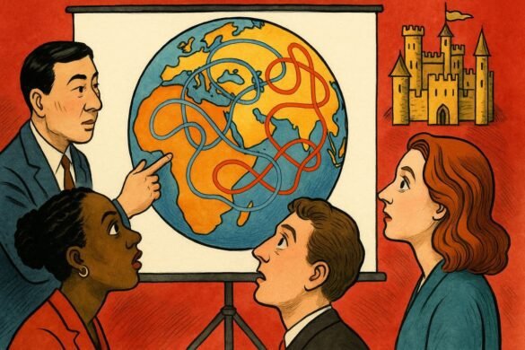
Every boardroom becomes an arena of silent competition when a new product launches for a global market. In these moments, the polished table reflects more than executives’ faces—it captures centuries of languages, colors, and hidden codes pulsing through every design. At the far end, a creative director presents the latest mockups. Half the room speaks Mandarin, a few use French, others Arabic, and English hovers like a lingua franca with tired edges. Nobody mentions it aloud, but all know: true design power means reaching across borders without losing meaning, emotion, or nuance. One misplaced color, a word mistranslated, or a symbol that stirs controversy could topple a campaign and scar a brand’s reputation for years. As the slides flicker, anticipation builds. What emerges from the glow is not just a new look—it’s a new dialect in the secret language of design that shapes empires.
The first time global design left a mark was not in glossy ad campaigns but in the hand-painted shop signs of 1960s Nairobi, where each neighborhood juggled Swahili, English, and a riot of local dialects. These signs stitched together communities, blending meaning for the eye and ear. Today’s digital platforms multiply this complexity a thousandfold. You are now both the shopkeeper and the storyteller, broadcasting to cultures you may never fully understand. Can your button labels and icon sets speak without offending, confusing, or excluding?
Picture a multinational team at Phoenix Games, headquartered in Berlin, racing to ship a blockbuster video game for simultaneous launch across five continents. Designers sat around the clock, checking every graphic and dialogue box for hidden cultural triggers. An innocuous cartoon character’s gesture, harmless in California, landed as a major insult in Istanbul. Hours of debate, dozens of revisions, and a last-minute call to a local linguist averted disaster. Not one headline followed the launch for the wrong reasons—a win measured in silence.
If you want your designs to land globally, begin with humility. Your audience is never monolithic. Consider Airbnb’s iconic brand refresh. The creative team ran color schemes and patterns past groups from Tokyo, Cape Town, and Buenos Aires, each bringing unique perspectives. What looked bold in New York appeared brash in Singapore. Tweaks were made: hues softened, fonts swapped, references adjusted. The brand found a visual accent that sounded natural in every city.
Language lives in images as much as in words. A global campaign by electronics giant NeoLux failed when a proud lion mascot (symbolizing strength in Europe) triggered negative connotations in parts of Southeast Asia, where the animal’s image carries a legacy of colonial exploitation. Replacing the lion with a dragon—a revered symbol locally—drove engagement up and complaints down. It’s a reminder that symbols do not travel well without translation.
You can measure global design success by how many people feel included without any extra effort. True mastery means seeing invisible borders and anticipating friction. Google’s Material Design system bakes this in by letting designers pick from an international library of iconography, color palettes, and even micro-interactions tailored for diverse audiences. It is not about watering down identity but about tuning into a frequency everyone can hear.
The stakes rise in industries like healthcare and fintech, where misunderstanding is not just awkward but dangerous. When MedVantage, a health app provider, entered the Middle East, the team consulted both local physicians and visual anthropologists. App navigation icons shifted from thumbs-up signs to universal hand gestures. Error messages went through five rounds of translation, each time asking: “Does this make sense to a patient under stress?” The result was not just fewer calls to customer support—it was gratitude from users who felt respected.
In fashion and luxury, global design is the tightrope between aspiration and authenticity. High street retailer Felice launched in Brazil with its Parisian branding intact, only to watch social buzz falter. A local creative director, Lucas Ferreira, was hired to weave native motifs and playful language into the summer collection. Within a month, product shareability spiked. People felt the designs saw them, not just sold to them.
Even the smallest design elements carry weight. Payment apps like PayX swapped red “cancel” buttons for soft blue, learning that red signals danger in the West but can symbolize prosperity in China. The micro-decisions behind these changes may never make headlines, but they build or break trust every day.
Beneath all these stories runs a philosophical current: design is translation. You do not simply transmit information; you code emotion, intent, and respect for the unseen. It’s a delicate form of diplomacy. In a world where algorithms flatten culture, you can resist by injecting empathy and nuance into every pixel.
Success in the age of multilingual power is not about a single style but about flexibility. The best designers study people first, then let patterns emerge. Zara Okoye, a Nigerian interface designer, advocates for “quiet observation.” Her team shadowed customers in five cities, learning how gesture and touch shift with language and climate. Her products, now used from Lagos to London, feel natural because they are rooted in lived experience.
When brands listen and adapt, they build something bigger than a product—they build belonging. Empires do not last because of armies or marketing spend, but because they embed themselves in the languages and hearts of millions.
After the launch, when lights dim and applause fades, the code remains—subtle, silent, shaping every new interaction. In the aftermath, the creative director stands alone at the window, watching the city pulse with the languages of tomorrow. This is where real design lives, where borders blur and empires are built one pixel at a time.
You will realize that every border crossed leaves a mark. What kind of mark will your designs leave on the world you cannot see?
