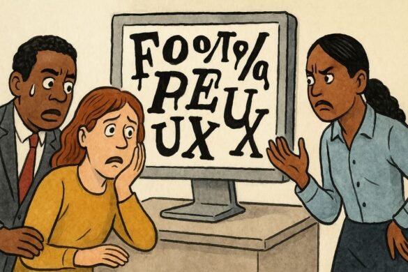
A sterile conference hall hums under the soft whine of fluorescent lights. Screens glow with eager anticipation, each promising to unveil the next digital masterpiece. But as a projection flashes onto the wall, the collective mood sours. Letters stagger awkwardly, heavy and clumsy, some sprawled as if hungover after a night of excess kerning. A wave of unease sweeps the audience: this isn’t design, it’s sabotage dressed as progress. The culprit? A font that wounds the eyes, crushing the delicate dance between beauty and function. In that uncomfortable silence, every designer present recognizes the crime. They have all seen user experiences ruined by nothing more than ugly typography.
Even in the hands of industry titans, fonts have betrayed ambition. Stories of failed app launches abound, with users flooding forums to vent about barely legible text or grotesque typefaces. When Airbnb shifted its font years ago, its community erupted, with one user quipping, “My grandma’s handwriting is easier to read.” While design teams scramble to justify aesthetic pivots, real people fumble through menus, their trust quietly eroding with every misaligned letter.
You sense it every time you squint at a garbled restaurant menu or tap away from a cluttered news app. The experience feels hostile, pushing you to work harder just to read, just to care. You wonder why, in a world obsessed with smooth interfaces, brands let bad fonts slip through. Typography isn’t window dressing—it’s the message itself. When it goes wrong, no clever UX pattern can save the journey. It’s like visiting a five-star restaurant only to find the menu smeared with mud.
Designers love to chase trends: the playful sans-serifs, the minimalist skinny scripts, the nostalgic throwbacks to ‘90s pixel art. But trend-chasing is a trap. A startup in Berlin famously tanked a campaign when its custom font, meant to evoke playfulness, left users comparing the site to ransom notes. The CEO, Lena Kaufmann, admitted later, “Our team fell in love with style over substance.” The backlash was swift, the lesson eternal: clarity always beats cleverness.
Yet brands keep betting on shock and novelty. They roll out experimental typefaces, confusing aesthetics with differentiation. You’ve seen this in mobile banking apps, where crucial numbers fade into pastel backgrounds, or in e-commerce giants whose quirky fonts force you to zoom in on your own device. Even tech titans fall into the trap. Twitter’s infamous Chirp font release sparked a user revolt—accessibility experts called it “digital sandpaper.”
Your own habits prove the point. If an article’s headline stretches too thin, or a button’s text feels cramped, your finger hovers just a moment longer, then drifts elsewhere. The world is ruthless: if you can’t be understood instantly, you aren’t read at all. Designers who dismiss typography as “just fonts” misunderstand its gravitational pull on trust and action.
There’s a psychological twist, too. When text is hard to read, research shows comprehension drops. But the emotional fallout is deeper: frustration festers. Instead of delight, users experience friction. Shopify’s former design chief, Mateo Rivera, once said, “Bad fonts don’t just confuse, they insult the user’s intelligence.” This is why so many design veterans insist on brutal font audits before launching even a single button.
Aesthetics matter, but readability matters more. It’s why legends like Massimo Vignelli championed neutral, timeless fonts for transit maps and wayfinding. He saw typography as infrastructure, not Instagram fodder. Today, some of the world’s most viral brands—think Duolingo or Notion—win by pairing joy with absolute clarity. Their interfaces whisper, “Relax, you’re safe here. Nothing will jump out and bite your eyes.”
Yet the cycle continues. Small businesses and billion-dollar unicorns alike routinely ignore feedback, blinded by internal echo chambers. Junior designers, eager to impress, reach for exotic typefaces. Middle managers, obsessed with differentiation, greenlight changes that alienate their core audience. The result: a digital landscape where beauty and legibility fight, but nobody wins.
Sometimes the damage is subtle. You might not notice the weird spacing on your banking app until you misread your balance or miss a bill. You only realize you’ve been tricked by typography when a sense of unease creeps in, undermining your trust. Once a brand loses that trust, recovery is nearly impossible.
Every so often, an old-school voice breaks through the noise. Type designer Tobias Frere-Jones once told a packed lecture hall, “A font is a suit for your message. If it doesn’t fit, the world laughs before they listen.” In that spirit, some brands have staged remarkable comebacks. Consider Mailchimp, which reversed a disastrous font update after user outrage, eventually emerging as a case study in humility and adaptation.
Still, many ignore the writing on the wall. Ugly typography remains a silent killer, toppling campaigns, draining engagement, and eroding trust one pixel at a time. The secret isn’t in more tools or fancier scripts—it’s in listening to users, respecting accessibility, and treating fonts as guardians of meaning. If you’ve ever abandoned an app because it “just felt off,” chances are, it was typography whispering a warning.
So why does this keep happening? The answer is cultural. In an era of instant gratification, patience for nuance vanishes. Teams scramble to launch, managers demand “something different,” and designers, battered by deadlines, cut corners. The first thing to go is always typography. The last thing users notice—until it’s too late.
A rain-soaked alley in a forgotten part of the city glows under neon signs, their letters sharp and inviting. A weathered designer studies those lights, recalling campaigns that soared and those that crumbled. The hum of the city seems to echo a single truth: clarity is kindness. Each letter, chosen or neglected, shapes trust in invisible ways. The designer wonders how many silent users abandoned journeys before they ever began, driven out not by bugs or features, but by the ache of ugly words. As the night deepens, the question lingers in the puddles: will you let your story vanish because nobody could read it?
