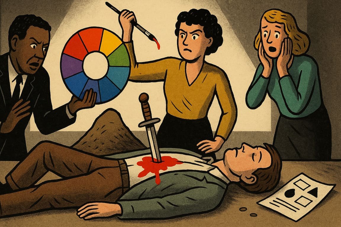
A pale spotlight sweeps across a half-empty art gallery, stopping on a single canvas smeared with electric blue and angry red. The crowd buzzes with curiosity. One child tugs her mother’s sleeve, asking, “Why do those colors feel like fireworks?” No one answers, but everyone senses the truth: color is more than pigment. It’s command, memory, mood, and meaning. In every city, brand, and campaign, color theory rules with an invisible hand. The fate of a design—its power to live on or vanish—depends on how color is chosen, blended, and unleashed.
A famed cosmetics house launches a new line, banking on neon pink. In the lab, researchers obsess over undertones, saturation, and afterimages. On launch day, shoppers flock to the store, snapping selfies and debating which shade unlocks the “it” factor. Meanwhile, a rival bets on muted earth tones and watches their collection fade into irrelevance. A single bold hue, wielded with purpose, can crown a champion or doom a contender.
It isn’t just the fashion world that bows to color. Tech giants have built fortunes on shades that signal trust, ease, or urgency. Think of the soft blue that welcomes you to social networks, the jolt of green on an instant message, the flash of orange when something demands action. Each decision is rooted in psychology and precision. A UI designer at a fintech startup once spent weeks testing fifty shades of blue, seeking the exact tone that calms nerves and says, “Your money is safe.” The right choice helped double user engagement.
You experience the power of color every day. A fast-food chain’s golden arches spark hunger on a lonely highway. A streaming service’s crimson splash promises adventure and escape. Even a city’s flag, waving at dawn, claims identity with its combination of bold stripes and silent pride. These are not accidents—they are strategies. The world’s top designers know color doesn’t decorate; it dictates.
Story after story reveals color’s control. A local bakery struggling with slow sales painted its walls a warm, buttery yellow, echoing the glow of fresh bread. Within weeks, foot traffic soared, and regulars swore the pastries tasted better. Psychologists call this the “halo effect,” where color changes not just perception, but experience itself.
Contrast brings drama to color’s reign. High-contrast combos shout for attention—a black logo on white packaging, a neon banner slicing through a midnight background. Some brands become icons on contrast alone. Yet, too much chaos breeds confusion. Mastery lies in balance: knowing when to clash, when to soothe, when to stand out, and when to blend in.
Fictional founder Eloise Park tells her design team, “Every campaign starts in black and white. Color is the final decision, the dealbreaker.” Her agency once saved a client’s struggling rebrand by swapping dull teal for a vibrant coral. The reaction was instant—buzz online, calls from new partners, a sense that something fresh had arrived. The magic wasn’t in the font or logo, but in the emotion triggered by color.
Science backs the legends. Studies in consumer behavior prove that color can nudge people toward action, linger in memory, and even change heart rates. A Harvard study once linked blue packaging to higher trust in health products, while red triggered urgency and impulse in retail. Marketers turned these insights into billions, but the core principle never changed: Color works on the body before the mind.
Culture shapes color’s influence too. Red screams luck in Shanghai, but danger in Stockholm. Green whispers growth in tech, but envy in literature. The world’s savviest global brands localize their palettes, adapting to the emotional codes of every audience. When a European supermarket entered Brazil, they replaced cold blue banners with tropical green and orange, turning bland aisles into a festival of abundance. Sales soared, not because the groceries changed, but because the colors spoke a new language.
Color is more than a tool—it’s a weapon, a bridge, a flag. The difference between a design that wins hearts and one that dies unseen is often a single, well-chosen shade. You don’t need a PhD in color theory to wield this power, but you do need courage. The best designers aren’t afraid to test, tweak, and even start over until every hue feels inevitable.
There’s a myth that color is subjective, a matter of taste or trend. The truth is bolder: Color is universal in its impact, even if the codes change from place to place. Designers who master color theory don’t just follow rules; they break and rewrite them. The real question is not, “What’s the right color?” but “What does this color make you feel—and will you remember it tomorrow?”
Every pixel, poster, and package you touch has been shaped by these invisible choices. Behind the scenes, color theory reigns supreme, deciding who gets seen, who gets skipped, and who gets remembered.
On a rainy afternoon, a tiny café sits empty until a single red umbrella appears outside, drawing glances through the window. Soon, another follows, then three more. Inside, a barista adjusts the fresh blue flowers on every table. As customers trickle in, they laugh, take photos, and order pastries they hadn’t planned to buy. The café’s owner, watching from the back, understands that today’s magic isn’t in the menu, but in the colors dancing through the rain.
A street artist, painting at dawn, mixes colors with hands stained from last night’s work. She knows her mural will live or die on the power of the palette. As the sun rises, passersby pause, pulled by emotion they can’t explain. Color rules, quietly and completely, where words run out.
You step out into the world, surrounded by choices. Will you use color to whisper or to roar? Today, design lives or dies by your hand.
