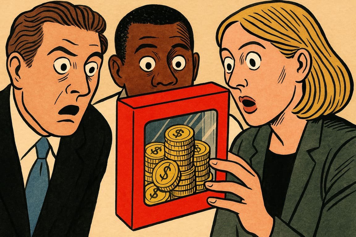
At sunrise, a convoy of delivery trucks rolls out of a warehouse on the city’s edge, each painted with a logo that started as a napkin sketch. The world’s biggest consumer battleground isn’t fought in boardrooms or digital ad auctions but on crowded supermarket shelves. Shoppers scan endless rows of boxes, cans, and bottles, their hands drawn to colors and shapes that whisper, promise, or even lie a little. In this quiet war, packaging design decides winners and losers. A single shift in texture, a splash of neon, a hand-lettered font—these choices build fortunes or quietly bury brands. As a store manager once joked to his staff, “If the box looks dull, it might as well be invisible.” Only design gives meaning to a sea of sameness, turning the ordinary into obsession, and a product into profit.
What makes people reach for one cereal over another when both taste nearly the same? You stand at the crossroads of impulse and loyalty every time you shop. Designers like Rina Patel, known for her bold redesign of the Zeal energy drink can, say it’s not about color theory—it’s about story. When Zeal swapped tired gradients for a vibrant matte black with a single silver stripe, sales surged. Shoppers called the new look “confident,” “mysterious,” even “cooler to hold.” This wasn’t just a can. It became a badge for a tribe that saw themselves reflected in a shimmer of silver.
Your first impression, they say, happens in three seconds. You feel it: the snap of a unique bottle cap, the weight of a glass jar in your hand. Packaging appeals to senses long before taste or utility registers. A premium chocolate bar, wrapped in textured, recycled paper with a tiny embossed stamp, whispers luxury with every crinkle. That moment of touch converts a skeptic into a loyalist faster than any influencer can.
Story matters. Look at the rise of Farm & Table, a dairy brand from New England. Its packaging swaps shiny plastic for hand-drawn cows and real farm addresses. That honest, rustic vibe didn’t just win design awards; it gave shoppers a tangible sense of connection. “We buy the story, then the milk,” quipped a regular customer in a viral TikTok. The emotional charge of design lands harder than a price discount ever could.
Design isn’t decoration—it’s persuasion in action. Sometimes, the right visual cue can overcome decades of bad press or sleepy branding. When a legacy soap brand, Liora, shed its faded pastels for vibrant blue-green gradients and punchy typography, old customers returned. The company’s head of design, Matteo Rossi, revealed, “We wanted the bar to feel like a fresh start, not an old habit.” Months later, social feeds buzzed with photos of Liora in trendy bathrooms.
Packaging also reveals the hard truth of sustainability. Gen Z consumers push brands to trade glossy lamination for biodegradable wraps and compostable inks. Those who adapt, like the UK-based snack startup Rooted, saw both eco-praise and profits climb. Their earthy packaging, stamped with a bold green leaf, became a symbol. It’s proof that smart design rides the waves of culture, not just consumer whims.
Competition makes the art fierce. When local Nairobi bakery Sweetgrain wanted to stand out from imported rivals, they went maximalist: hand-painted, patterned bread bags that turned loaves into gifts. Their Instagram exploded with unboxing videos. Every share became free advertising. Customers returned, not just for the bread, but to collect every new bag. Packaging, once an afterthought, became the center of a community’s daily ritual.
Failure in design carries a hidden price. A vegan mayo company, SureSpread, launched a minimalist squeeze bottle that looked almost medicinal. Sales sputtered. Focus groups admitted the package “looked like hospital food.” The fix? Designer Priya Menon added playful illustrations and a big yellow cap. Within weeks, stores couldn’t keep shelves stocked. If design fails to spark feeling, even a perfect product languishes.
The best packaging teams now borrow from psychology, cinema, and even viral memes. When Danish water brand AquaSky printed a simple “Open me for magic” under its cap, people lined up to film their surprise for TikTok. The interaction made each bottle a ticket to a micro-adventure. That simple sentence, paired with a playful blue wave, turned ordinary water into an experience.
Beyond art and emotion, great packaging delivers trust. When luxury tea house Ember switched to tamper-evident seals and clear ingredient labeling, anxious buyers relaxed. Sales in skeptical markets doubled. People buy with their eyes, but they stay loyal when the package delivers on its promise.
In times of economic pressure, some companies slash packaging budgets. Yet history sides with the rebels who double down instead. Remember the overnight cult status of Crave, the protein bar with packaging inspired by ’80s comic books? Founder Sam Rivers explained, “We bet everything on the idea that people want to feel something before they eat.” The gamble paid off, sparking a frenzy of copycats.
Design teaches that value can be conjured from thin air. When every product claims “premium,” the package that dares to feel strange, witty, or defiant wins the game. Supermarket aisles turn into art galleries. Shoppers seek surprise, not just utility.
Design holds a mirror to culture itself. Trends fade, but the hunt for resonance—something that “just feels right”—never ends. Every package is a silent ambassador, calling out to busy hands, making millions not by shouting, but by speaking to something deep inside us.
After closing hours, the shelves whisper with color and promise. Packaging sits in the dark, waiting to be chosen, carrying the memory of every story, touch, and surprise it delivered. Someone, somewhere, will reach for that box tomorrow and discover a piece of themselves.
You are always a decision away from creating desire or missing your moment. What will your package say when the world’s attention is up for grabs?
